Role: UX Designer, Workshop Facilitator & Researcher
Company: Essent
Year: 2024

The research team in our department at Essent is a beacon of customer knowledge. They are always busy gaining new insights about our customers through qualitative and quantitative research. For this reason, they are often asked to contribute their knowledge to most of our decisions or give advice on what kind of research we can best apply to a certain question. They are happy to be involved in those kinds of conversations.
Their only realization is that most of their time is used, more or less, for 'run activities.’ These are standard research activities or answering questions easily found in the insights library. They want to do more complicated research.
How can we create an accessible toolbox within Essent that helps reduce the time the researchers spend on ‘run-activities’ so they can focus more on more complicated research?
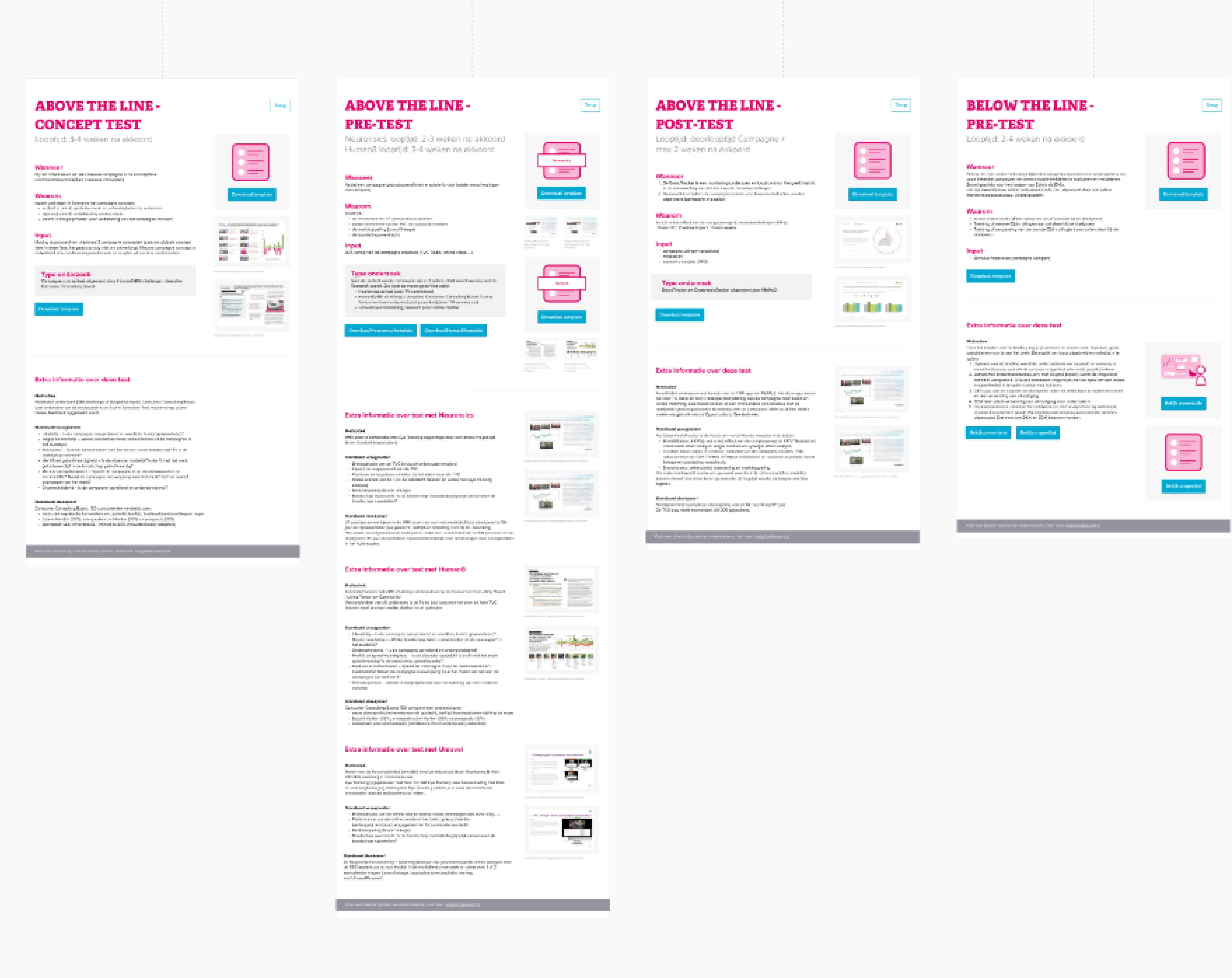
When these kinds of requests come in, one of the first questions I often ask is, how do you solve this challenge right now? We already established that this isn’t the right one. However, there is important knowledge that we can use in our next iteration. So, I created a workshop where we created an overview of what a usual research process would look like and what the strong and weak points were. The other thing was thinking about the types of research they do. What are already standardized, and which are not? Which do we want to standardize further, and which do we not want to?
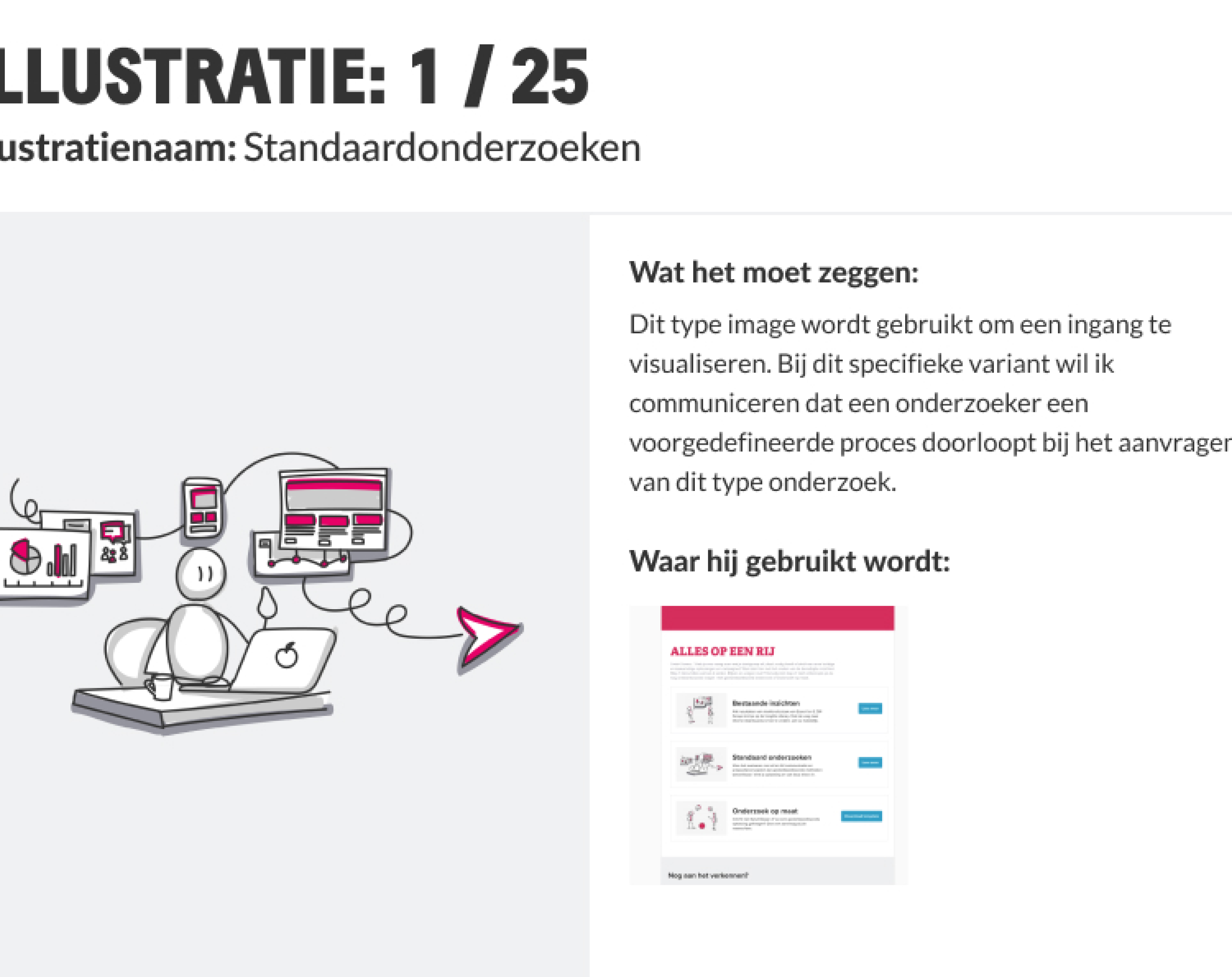
When we were thinking about ways of displaying these insights and research methods, the idea of a toolbox quickly came to our mind. We wanted to make this in Mural to see if it works before investing more time in it. Based on the first exploration, we made it clear which steps of the research process the toolbox can be used for and what kind of research topics it can include.
Based on the rough concepts, we made the toolbox more concrete. First, a flowchart to outline a rough flow of pages. I added a small summary of what kind of information would be there. The flow was created with two types of users in mind: one who is already familiar with the tool and wants to find their answers quickly, and the other who isn’t familiar yet with the toolbox for different reasons. These are the people you want to be able to guide more.
While I was working on the flowchart, I realized that the current toolbox was mainly focused on the familiar user, who wanted to find the answer to the question quickly. So, I added more explanations and a research wizard to help new users find the right research for their questions. After gathering feedback from the researchers, I was able to make the next iteration of the conception phase.
Because we already discussed the flow and what kind of content we would expect per page, the wireframing phase was easy to create. There were some design principles I tried to apply while making these designs:
When the pages' structure became more concrete, I was also able to pinpoint what I needed from the researchers. So, after the next feedback session, I was able to get feedback on the wireframes and tell the researchers what content I needed and when it should be delivered.

When the structure is set and the content is delivered, my task is to make it a working product. I like to start by finding designs that fit our chosen structure. While we already have an Essent brand, there is still enough room to play. With every screenshot, I like to mention what I like about that design for my future self. Based on that, I created some kind of font hierarchy in Mural (even though I couldn’t use the official font), colors I wanted to use, space blocks (because Mural doesn’t have fancy grids), buttons, and illustrations.
Designing on a platform that isn’t primarily used for these kinds of applications was a tough nut to crack. The most difficult part was creating some buttons. Mural and Miro make a block on the top/right to show a link. But I wanted to have an actual button. I discovered that if you double-click on that button image, it will go to the desired location. So, it became somewhat like a button.
The next challenge was to make it more colorful. Even though Essent's brand already has nice colors, it has no illustrations. Essent's current style primarily focuses on icons or actual images—not something in the middle. With my project, I was able to make the need for this even more concrete and introduced it together with the Branding lead and an external design company. This illustration style was useful not only for my project but also for the company.
After a few weeks, the first version of the toolbox was live. The researchers wouldn’t be researchers if they weren’t researching this tool. So we created a few demos with different departments that would be using the product to see what they think of it. The general feeling from the users was that this was a helpful tool. Of course, they also came with feedback, but our feeling was that the launch of the product was a success.
After a few months, we heard that the company was moving from Mural to Miro. So, I had to recreate the toolbox again. This was a great moment to process all the feedback given in the months that users were using it. But the great thing is that you see that the tool is helping the researchers to reduce the ‘run-activities.’ It’s hard to give an actual number, but the researchers feel this tool helps them. It is a great feeling that you were able to help them.
I tried to have a close connection with the researchers in this project. That way, we were able to make quick decisions, have fewer discussions, and move forward. I enjoyed this relationship.
Something else I learned is how complicated the creation of illustrations is. We needed multiple sessions with the design company to perfect the style I needed to communicate what I wanted to communicate and how this connected with the brand guidelines. The main discussions were about the background usage, how complex an illustration needs to be, and how much different line thickness we wanted to have. I was proud of what we had created, but then, you see, it’s also a preference thing. We also had lots of negative feedback about it. But because we made some conscious decisions, we could give them valid arguments for why the style is like it is. It was very interesting to be part of creating the illustration style.