Role: UX Designer & Researcher
Company: bol
Year: 2019


Finding the right product for your needs can be a challenge at Bol.com. Bol.com prides itself on having the most extensive assortment in the Netherlands and Belgium, which has grown to a total of 23 million unique products. When you select a category, such as televisions, you still have to sift through more than 800 products. In our exploratory UX research, users identified this as a significant challenge. They often don't really know why they select a size or type of screen technology. This decision is usually based on personal experience or advice from someone tech-savvy, which sometimes isn’t the best information. As a result, some customers make expensive mistakes that could be easily avoided.
How can we enable users to make informed choices when they select a refinement value?
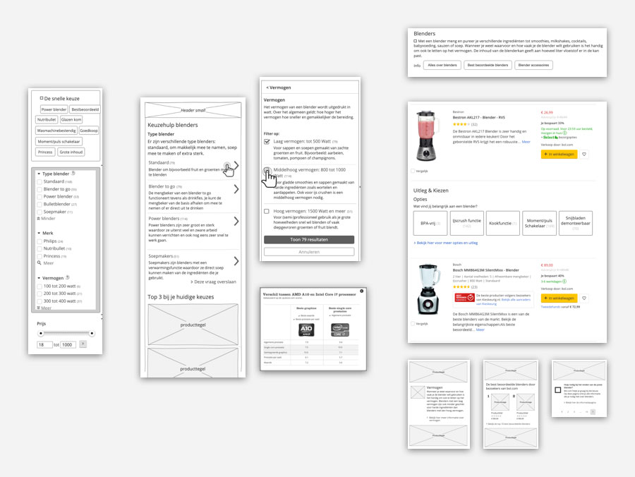
Based on insights from UX research and our goal, we started creating solutions for this problem. We considered visually arranging refinements to guide users to the most essential options, explaining the category or a specific refinement better, or creating a separate page to describe a refinement and its value. Thus, the Choice Helper was born.
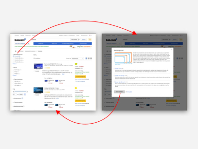
A visual designer and I created the first version of the Choice Helper, a basic flow. Under each filter that could be further explained, we added a link named "Keuzehulp," the Dutch name for Choice Assistant. When users interacted with Keuzehulp, a modal window opened with an explanation of the refinement and its values. To highlight the explanation, we created our own icon based on the diverge and converge idea of the design process. We tested this idea with a prototype, but the reception wasn’t great. Users couldn’t find the Choice Helper. However, users were very enthusiastic once they found and opened it, but overall, it wasn't as effective as we hoped.
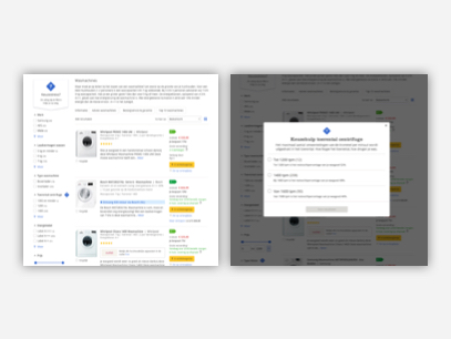
With the insight that users couldn't find the Choice Helper, we created a new prototype. We added an explainer label above the filters to highlight and explain the idea, and included some visual recognition with a unique Choice Helper icon. The modal window was redesigned to better guide users through the information. Testing this version revealed the same problem: users simply didn’t find the functionality. This worried me, and stakeholders began to ask questions about why the feature wasn’t performing. I started doubting my skills.
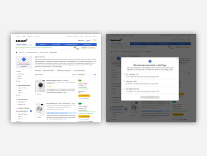
Determined to make it more visible without overshadowing other functionalities, we gave the general explanation of the functionality more attention and updated the label beneath the filter with new copy: "Do you need some help with this choice?" Fortunately, we tested this version as well. The same problem occurred: users still didn’t see it. Unsure of the next steps, I took a break. People at Bol.com have more ideas than time, so I started another project. After a successful test, I had new energy to tackle this problem.

With a fresh mind, I reevaluated the disclosure of this functionality. We knew the icon didn’t help much, so we changed it to an icon commonly used to visualize links. Another obvious change was to switch the link color from black to blue, the most common internet pattern. The final change was the copy. Users didn’t like the name "Do you need some help?" as they felt they weren’t lost. We changed the name to hint at the content behind the interaction, giving a sneak peek of what users could expect.
We decided to test this functionality one more time through an A/B test: one version with the Choice Helper and one without. We measured two KPIs: usage of refinements and conversion. If either increased, we would consider it a successful test. After four weeks, the results were positive! There was an increase in both usage of refinements and conversion. I was over the moon with these results; our efforts finally paid off. We could confidently say that the Choice Helper helps users with their decisions.
This project had its challenges, but it showed me that I can crack any problem, though sometimes it's best to pause and come back later. It also made me humble; admitting to stakeholders that I couldn’t solve the problem was tough, but it earned their respect and gave me another chance to solve it, which fortunately had a happy ending.