Role: Workshopper, Researcher & UX Designer
Company: Briq
Year: 2021


The planboard is a page in the Briq app where merchants of an activity center can see who is doing which activity and when. This page should provide an overview to the merchant but is often also a starting point for receptionists to book activities when a customer calls the venue. So, different use cases are connected to this page.
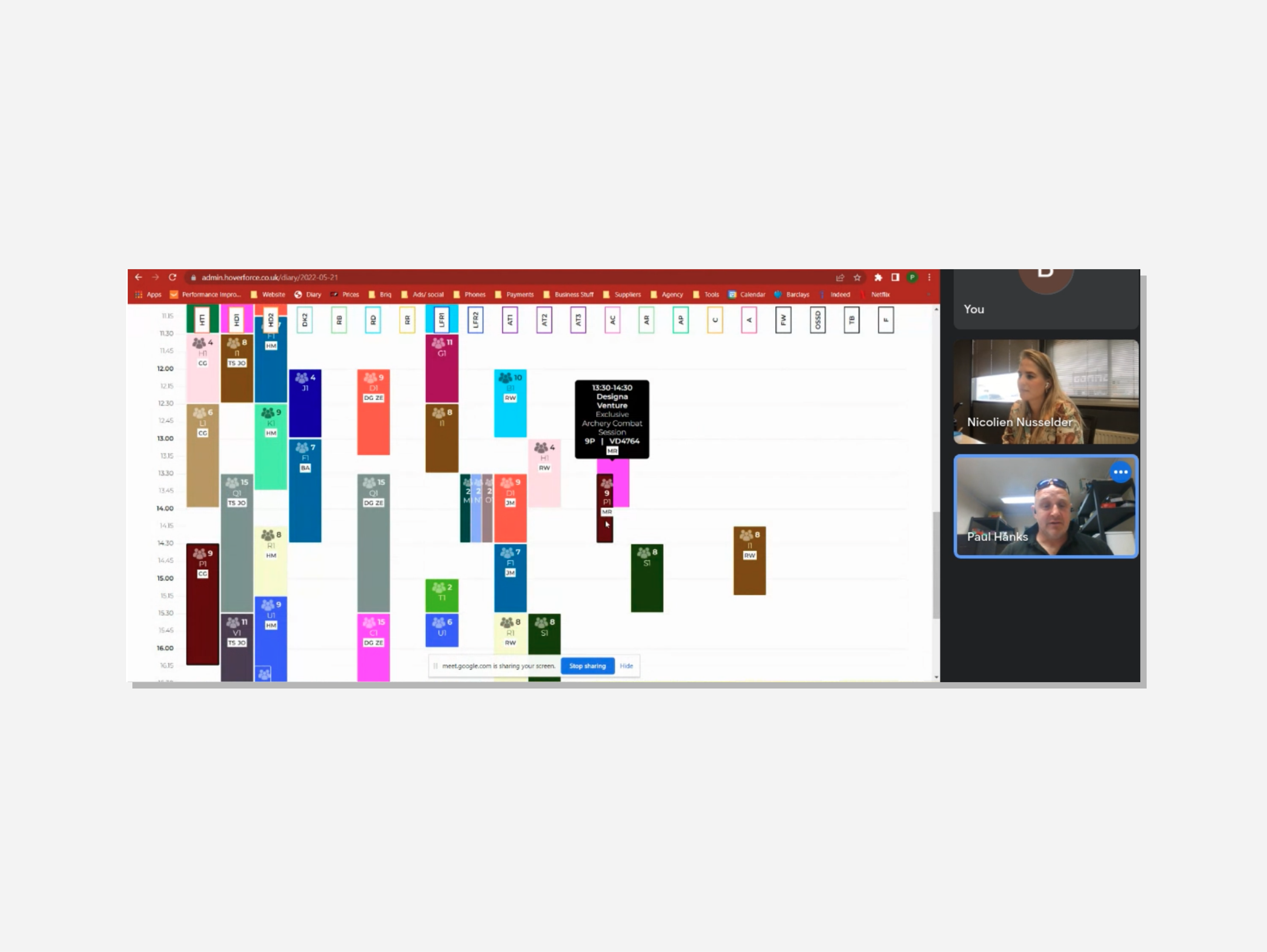
The current planboard was specifically created for activities that have one place where the activity takes place. Go-karting is something you do on a go-karting track. Other activities like laser tag, mini golf, and escape rooms often have similar behavior. This way, the planboard could give you an overview of multiple activities on one page. Briq decided to add the bowling activity to their portfolio. However, when these merchants were setting up their shop in Briq, they noticed that the planboard wasn’t working as they expected. Every bowling lane had its row on the planboard. Some of you know that some bowling venues have many bowling lanes, leading to an overcrowded planboard. This was the initial beginning of the project.

How can we redesign the planboard to handle the booking and management of activities with multiple locations without overwhelming the user?
The product owner and I heard about this problem from one of the customer service specialists, and we had time to work on this topic. We knew that this wasn’t the only problem with the planboard. Over time, we heard things from merchants and our colleagues. To create an overview of all these problems, we decided to have a round of stakeholder interviews and also a round of interviews with some bowling merchants. I took the time to prepare a script and plan the conversations. The product owner was there to observe and collect notes. After the interviews, we gathered several problems that this planboard had.
When the product owner and I heard these requests, we thought we needed to prioritize them immediately. This would help us focus on the most critical problems. So, we created a few slices prioritizing which issues we wanted to solve.
Because many booking systems in the leisure industry seem to be created in the ’80s and never updated, I knew I had to look more at other similar systems, like calendar apps from Google and Apple. I also looked at sites like Behance to see how they solve issues.

With prioritization in mind, I started sketching. At Briq, we use Figma as our design app, but ideally, you don’t want to work in an application that is more focused on creating high-fidelity designs. However, because it was my application where I also collected all insights, explorations, and discussions, I really wanted to be able to sketch in Figma. But there is no native app for Figma on iPads. After some research, I noticed that other designers had the same problem. Fortunately, Nelson Taruc created a Medium article explaining how to use an app called Figurative to sketch in Figma. After some testing, I knew this was something that could work. Once I started drawing, I realized I could explore every problem very easily. So I did that. When I had something, I showed it to my product owner and a few developers. They liked these first sketches. It was time to update the company about our ideas.
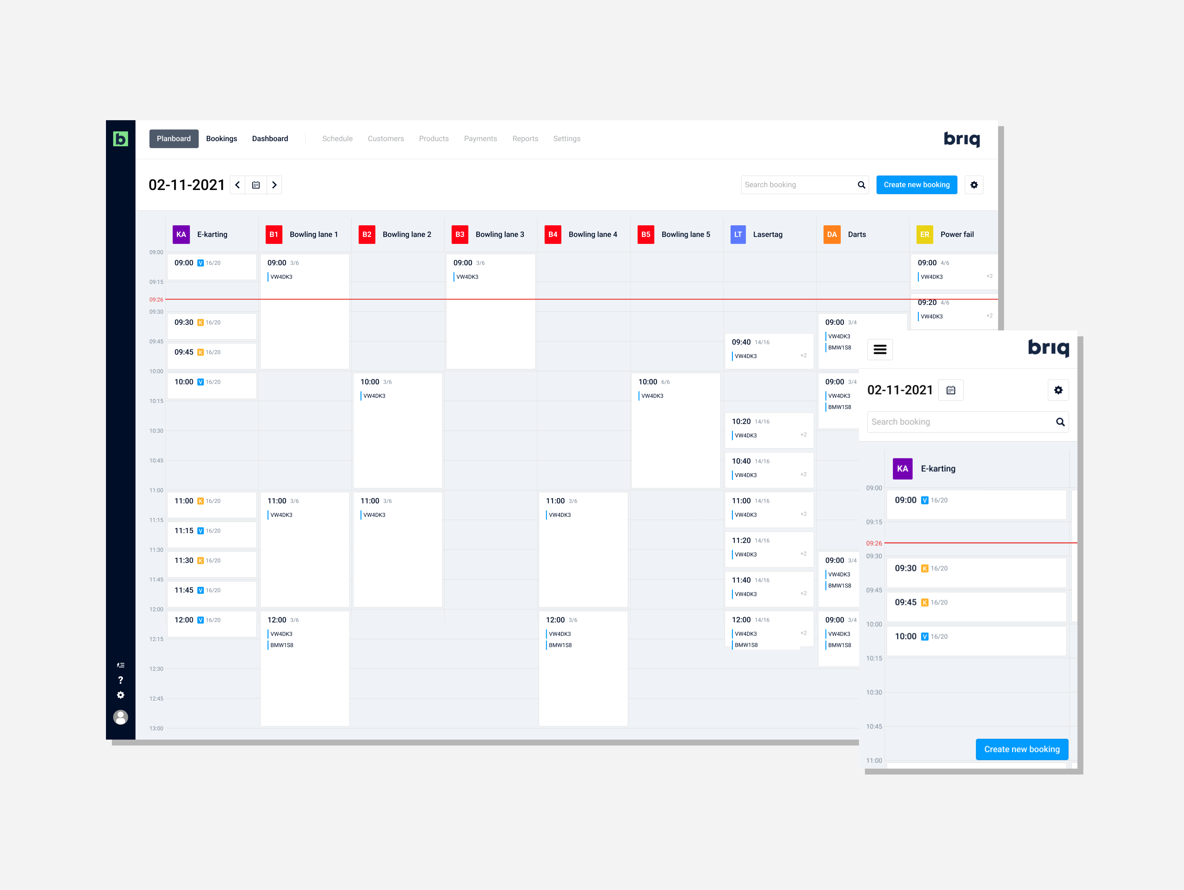
We knew a project requires a significant investment of time to make it good. Often, we need to involve the most critical stakeholders to decide if we want to proceed. So, a tremendous visual was required to sell this idea, and a rough sketch would suffice for the smaller ideas. But we needed something to make the stakeholders enthusiastic about this idea. Based on conversations with the product owner, we selected a few core ideas: calendar-like, responsive, and easy to manipulate. I made a visualization on one board. We showed this in our stakeholder meeting, and we got the go-ahead for the next phase.
The concept was a great way to show the company what we envisioned when we said we wanted to redesign the planboard. But we also needed to get feedback from our merchants. So, I created some sessions where merchants could critique the idea. The biggest issue they mentioned was that some features were missing that they wanted to have. The most important was to see the status of a booking easily, such as if it was a kid’s party or already paid for. This was something we needed to add to our first version.
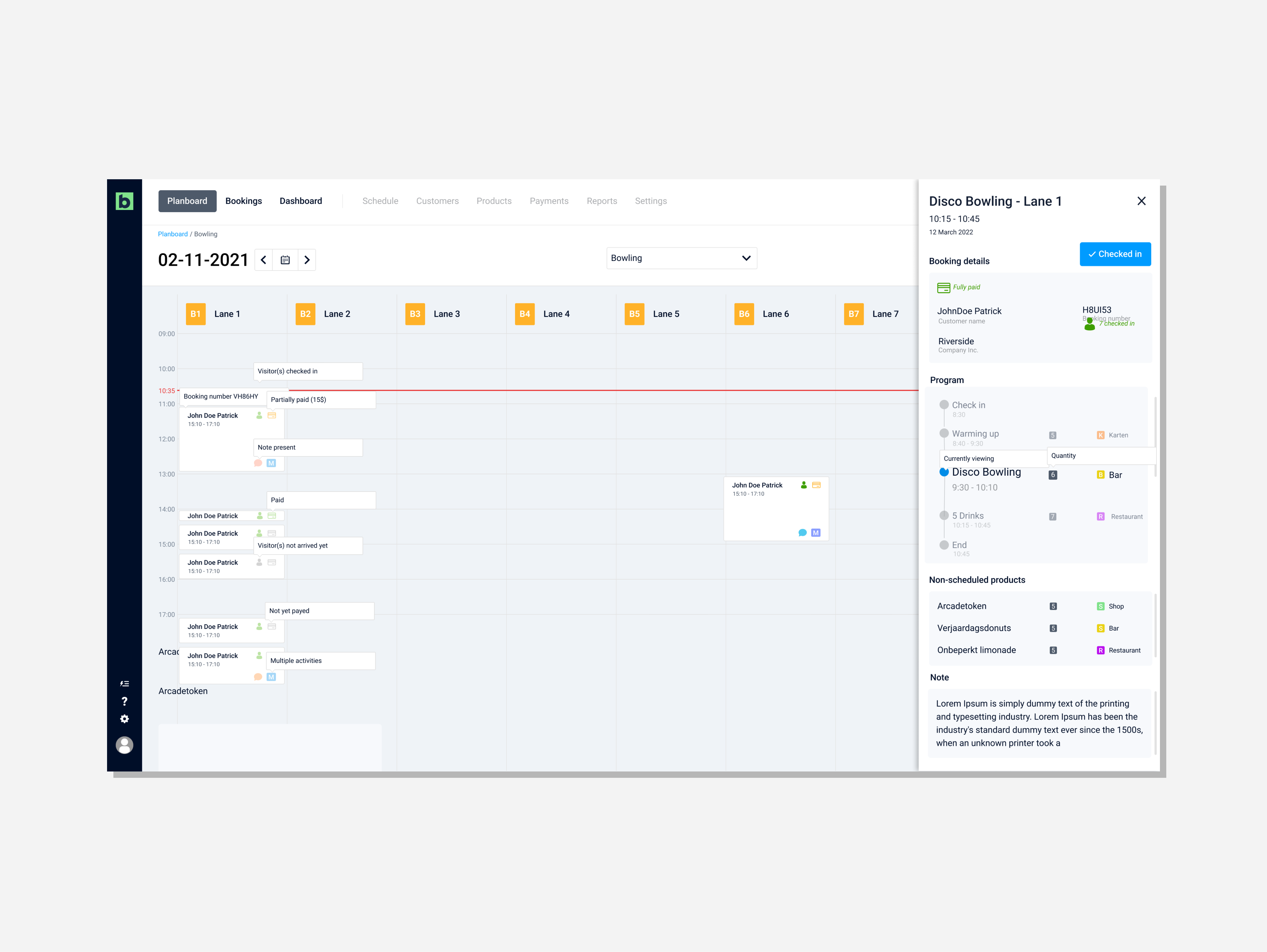
This was the moment when a new UX designer joined the company. I took on the onboarding to help her get productive as fast as possible. After the concept images and the feedback from the merchants, we started to make some iterations on this concept. Because development was updated along the way, we added some input they had. So when this came into refinement, we could create user stories without problems. This was very nice!
When the first versions of the planboard were developed, we had some bowling merchants testing the new planboard. Every iteration led to improvements but also positive feedback. When the final version was released, we saw an increase in the number of bowling merchants using the Briq app. Therefore, we saw this as a success.
In this project, I learned that the strength of a great, well-visualized idea can take you a long way. With these massive projects, it's also essential to know what you are fixing, who you are helping, and what this will mean for potential new clients. But when these things come together at the right moment, it’s satisfying to see a project like this come to fruition.
I also never had the opportunity to onboard a new designer. Briq was a company with one designer, me, so when someone new joined, it forced me to create more structure in the work so somebody else could adapt to it as fast as possible. I felt this went very well. It helped us have a good relationship in other projects, and eventually, you knew what to expect from one another, making collaboration very enjoyable.